


Unlock more with the Adobe Podcast Premium plan 
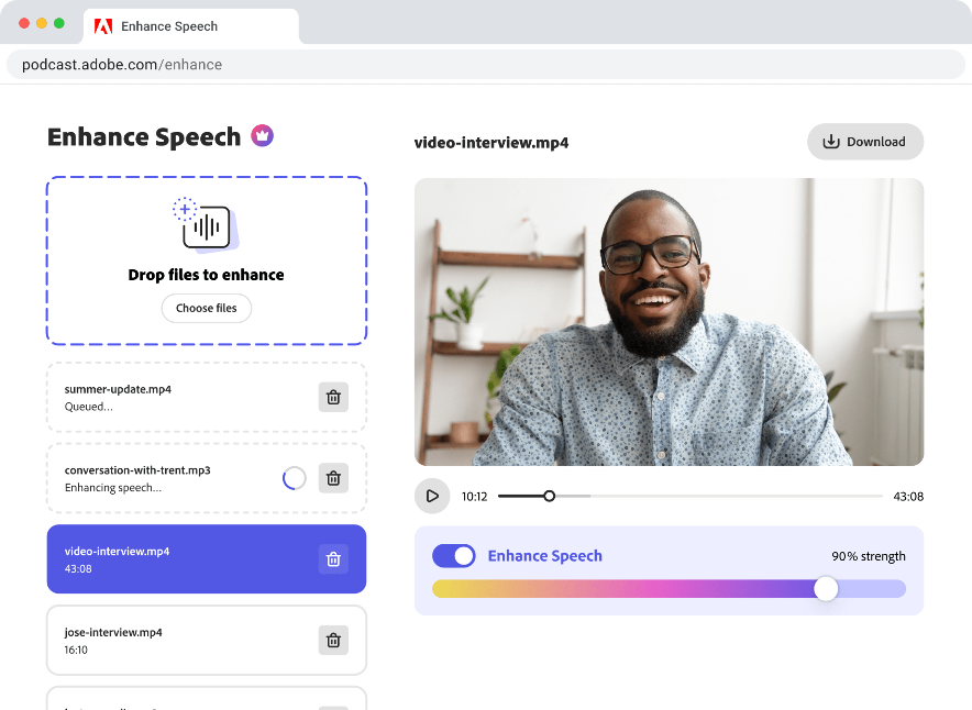
- Enhance Speech fixes audio problems after the fact, no perfect mic needed
- Video support for MP4, MOV, and more
- Bulk upload files for enhancement
- Adjust speech, music, and ambience for a more natural sound
- Enhance up to 4 hours a day, files up to 1 GB
- No download limits on Studio projects
- Download original recordings, speaker-separated
- Customize audiograms and captions with themes
- Upload custom backgrounds for audiograms
- All Premium features for design
Enhance Speech


Studio


Design with Adobe Express Premium

 Start free trial
How to create podcast cover art that stands out
Make a lasting first impression: Tips for designing eye-catching podcast cover art.
Last updated: April 16, 2025
Author: Harmony Jiroudek, Product education & community manager
With over 4 million podcasts worldwide, it’s important to take any opportunity you can to stand out from the crowd. One of the best and easiest ways to do this is to invest a little extra time in your podcast cover art. After all, it’s an important element of your program and brand identity.
What exactly constitutes great cover art is a subjective matter and there is no real bar to clear. But good cover art should at least be memorable.
Odds are, you didn’t get into podcasting because you’re a revolutionary graphic designer. If you don’t know where to start, have no fear; we’ll go over why podcast cover is important and some tips for how you can make your own.
Why podcast cover art matters
Hearing a great song or album, especially when it’s something we first enjoyed years ago, typically causes us to recall other memories and imagery from around the same time. Listeners form associations while engaging with the media, and things like logos, cover art, or thumbnails all can all help bolster those emotional connections.
It doesn’t need to be Darkside of the Moon-tier, but cover art should be something you can use and reuse for your brand. Even if you’re podcasting just for fun, you’re still perceived in the same way as a brand to listeners, and sensible cover art helps their minds put all the pieces together.
Rather than focus on a specific style, consider what best fits the mood of your podcast.
How cover art ties into the marketing of your show
Inconsistent imagery and voice in your marketing collateral can be frustrating for your listeners. Consistent cover art is one way you can identify yourself, which is especially important when distributing across platforms.
Plus, cover art is typically the first thing a potential listener sees, whether searching for or discovering new podcasts. So make sure you have something recognizable to not make finding your podcast any more difficult than it needs to be.
A helpful way to keep things consistent is to set up a template in a software like Adobe Express. Put together an image in appropriate social media dimensions with your brand graphics, colors, and text. Then, just plug in whatever you need (episode titles, show number, specialty graphics) and export your art.
Tips for making great cover art
We can’t teach you how to be an industry-leading graphic designer. However, we can provide some basic advice to help point you in the right direction. With a little work, you can make a great piece of cover art that excites both you and your listeners.
As long as you keep these things in mind, you should be able to DIY your way to something cool:
- Start with the right format. Both Apple Podcasts and Spotify want a JPG or PNG that’s 3000 by 3000 pixels. Stick with this size for your finished product since it also works well for YouTube (and scaling down is almost always easier than scaling up).
- Choose colors that have impact. Think about what colors might best convey the vibe of your podcast while trying combinations that call to your palette. If you’re unsure, consider looking into how people most commonly respond to various colors in the visible spectrum and adjust accordingly. And make sure your color combos are accessible by using a web-based color checker.
- Find suitable typography. There’s a trove of fonts to be found across the web, and just as much to learn about typography. The shape and flow of a typeface reflect a “personality” that should align with the rest of your imagery—if it “looks weird” or “feels off,” try something different.
- Make sure it looks good when small. When shrunk to fit a smaller device or work as a thumbnail, cover art should still be recognizable. If reasonably shrinking your cover art makes it too unclear, you may want to reconsider color, typography, or imagery proportions.
Try Adobe Express, especially if you're new to design
Learning full-fledged design is time-consuming and difficult, even for the most artistically inclined. That’s why we recommend using Adobe Express, which is included in the Adobe Podcast Premium subscription.
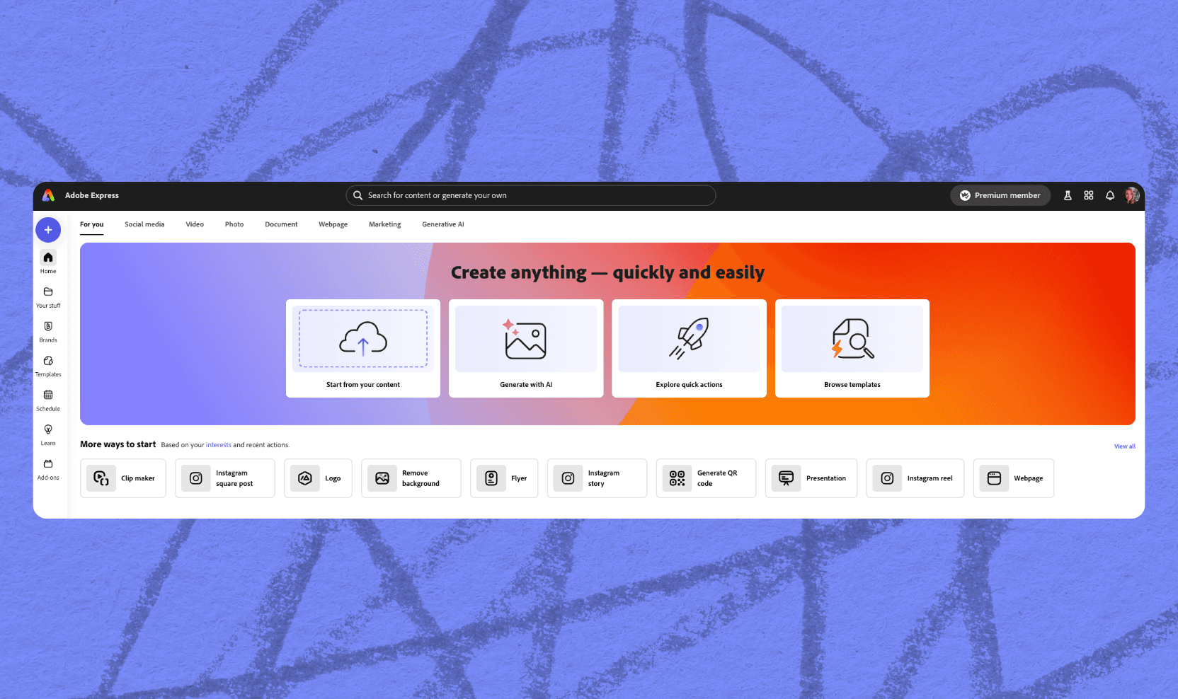
Adobe Express is a free, web-and mobile app that lets you create graphics, videos, web pages, and more. It's aimed at mainstream users, not professional graphic designers. You can use it from any device to access tons of free (and premium!) templates. With Adobe Express, you can work on your designs from anywhere with a powerful set of built-in tools.
You’ll have podcast cover art you love in no time.
Make something you’ll be proud to show off!
What distinguishes good and great cover art is debatable, but you’ll want to at least “check the boxes” to ensure you create something consistent and recognizable.
While it's true that you shouldn't judge a book by its cover, visuals significantly impact a viewer's mood and help make your show memorable. If you're new to graphic design, try Adobe Express. You'll find it easy to use and inspiring.
Find Adobe Express on Android, iPhone, or the web today.
About the author: Harmony leads product education and community for Adobe Podcast. As a musician and educator, she brings a human-centered approach to helping creators learn, connect, and grow with powerful audio tools. Her passion lies in making creative technology feel accessible, empowering, and inspiring.